No study of mortality is complete without a deeper analysis of underlying causes, as well as influential socioeconomic, demographic or even geographic factors.
In this article we will focus on the seasonality of mortality in Spain, including causes of death and modeling.
Let us begin by defining seasonality. Seasonality refers to a pattern or trend that repeats within time intervals such as every month, every quarter or, as is the case we want to address, every year.
In order to carry out this analysis, only the death data by cause and month published by the National Statistics Institute of Spain (www.ine.es) for the period between 2002 and 2018 have been taken into account.
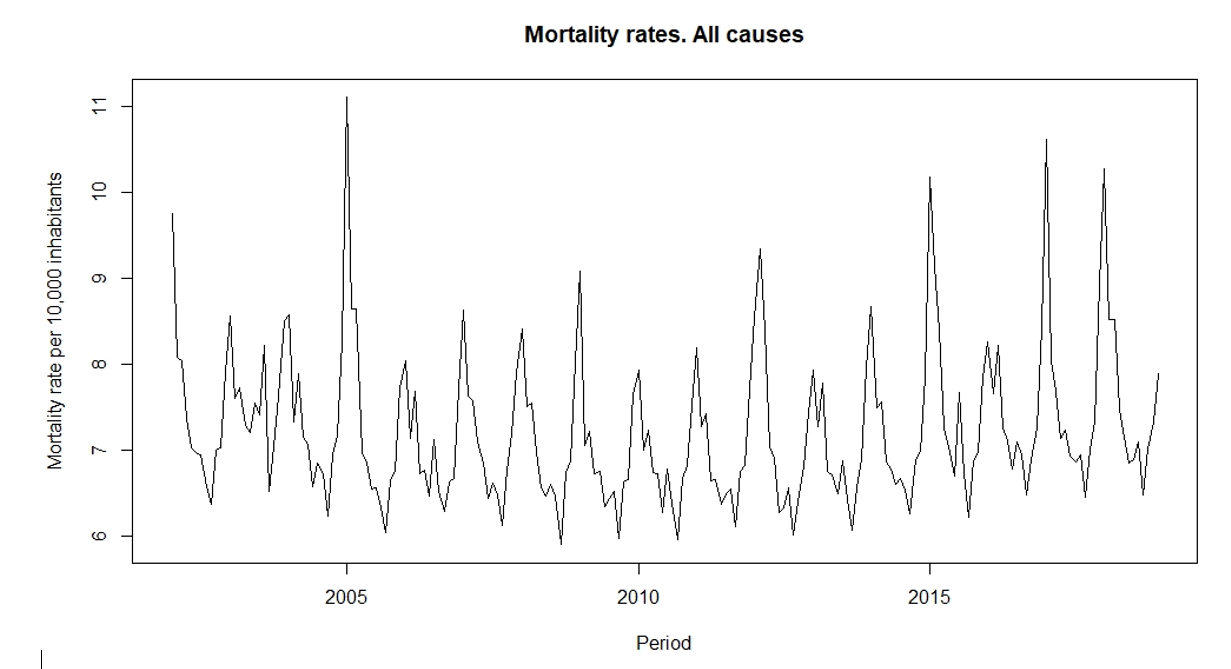
Figure 1 shows the monthly death rates in Spain for the period 2002 - 2018. A seasonal pattern can be observed. In which the winter months, the mortality rate is highest, while summer months present lower rates.
Figure 1:
Graph of mortality rates per 10,000 inhabitants
This higher mortality rate during the months corresponding to the winter season can affect insurers, and especially life insurers. Understanding the causes of seasonal mortality, as well as the reasons why seasonal mortality is higher than expected in certain years, can be vital for (re)insurance company planning.
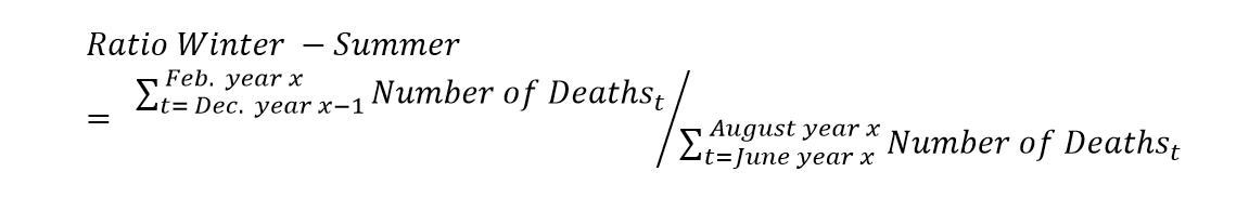
Although mortality in the colder months is expected to be higher, the magnitude of seasonality varies from year to year. One way to assess the degree of seasonality can be through a ratio that compares the cold months with the warm months. In this way, in order to calculate the ratio of winter to summer for a certain year, we will divide the number of deaths for December, January and February by the number of deaths of June, July and August, where the number of deaths in December correspond to the previous year:
From Figure 2, we can clearly see that winter months experience higher levels of mortality with the winter-summer ratio exceeding one. We can also see that the degree of seasonality varies from year to year, reaching exceptional highs in certain years.
Figure 2:
Graph of the Winter-Summer ratio by year
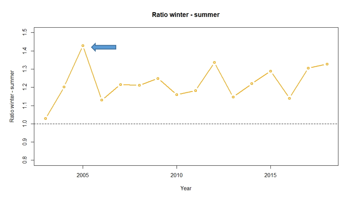
As Figure 2 illustrates, the year 2005 is striking in Spain, with the most deaths from flu to date. In the first quarter of the year, deaths grew 21% more than in the same period in 2004, while the population only grew by 2%.
Analysis of the causes of seasonality in mortality
Factors influencing mortality can have a varied origin. These range from intrinsic factors, such as individual habits and behavior, to external factors, such as healthcare access levels or overall incidence.
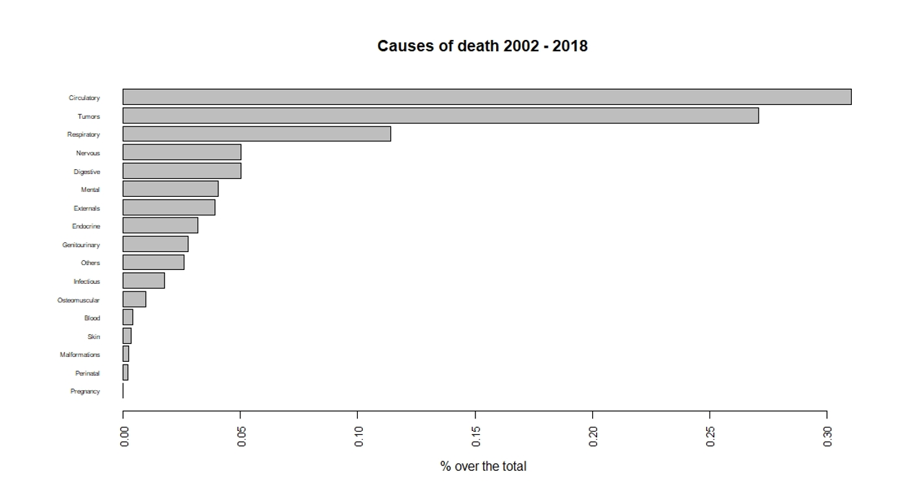
In 2018, 67% of deaths in Spain were caused by three causes : diseases of the circulatory system accounted for 28% of deaths, tumors 26%, and diseases of the respiratory system 13%. If we look at the entire series (2002 - 2018) in Figure 3, the main causes of death do not vary, although they represent 70% of the total.
Figure 3:
Graph of mortality causes in Spain from 2002 to 2018
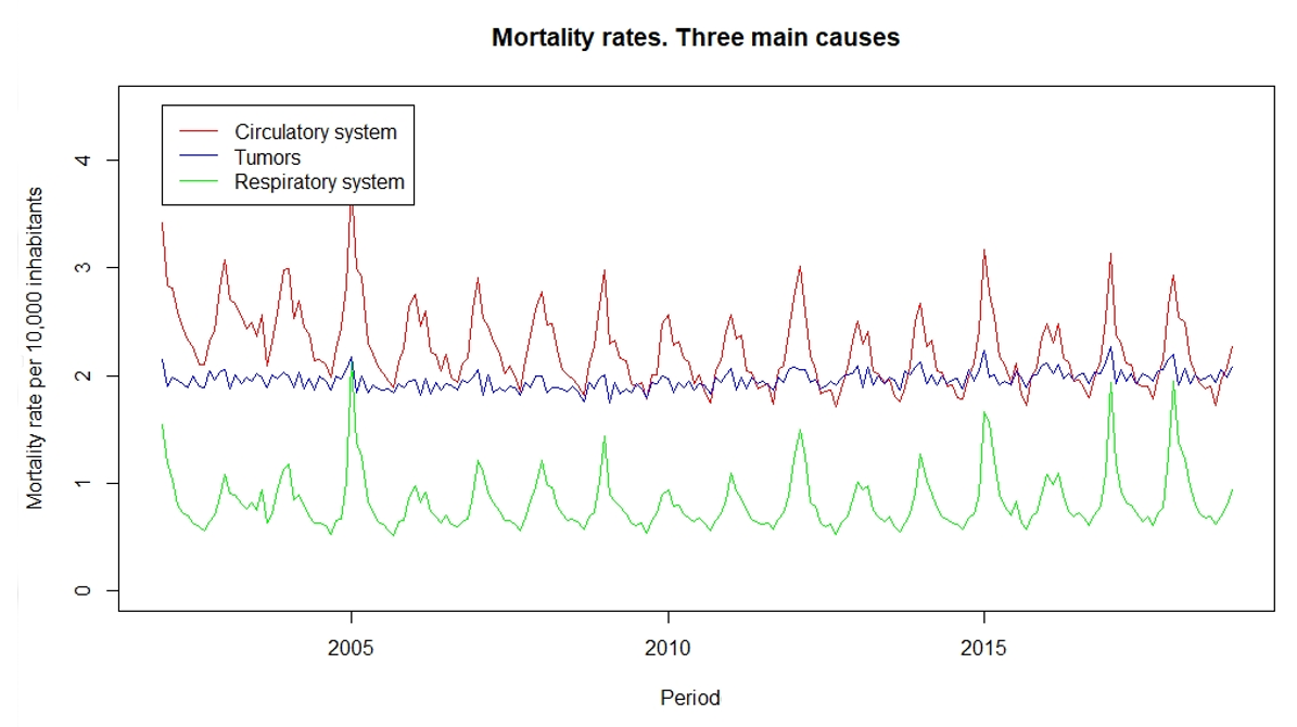
Focusing on these three most significant sources of mortality, we observe that deaths from tumors do not show signs of seasonality, with winter-summer ratios close to one, while those caused by diseases of the circulatory system and diseases of the respiratory system do. Both in the case of deaths from diseases of the circulatory system and from diseases of the respiratory system, the highest mortality rates are found in the coldest months of the year. Figure 4 represents the monthly mortality rates of the three main causes of death in Spain.
Figure 4:
Graph of mortality rates for the three main causes of mortality
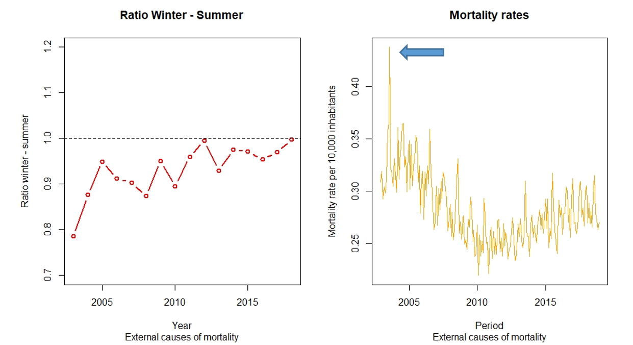
Seasonality does not always have higher mortality rates in the winter months. Consider the external causes of mortality shown in Figure 5. For these causes, the winter - summer ratios are lower than one, which means a higher number of deaths occur during the hottest months, coinciding with the most relevant holiday periods in Spain. It is notable that in 2003, 12,919 more people died than in 2002 during the months of June, July and August due to a heat wave. The heatwave of the summer of 2003 was so lethal in Spain that the death rate rose 13% compared to the previous year.
Figure 5:
Graph of Winter – Summer ratio and mortality rates for External Causes of Mortality
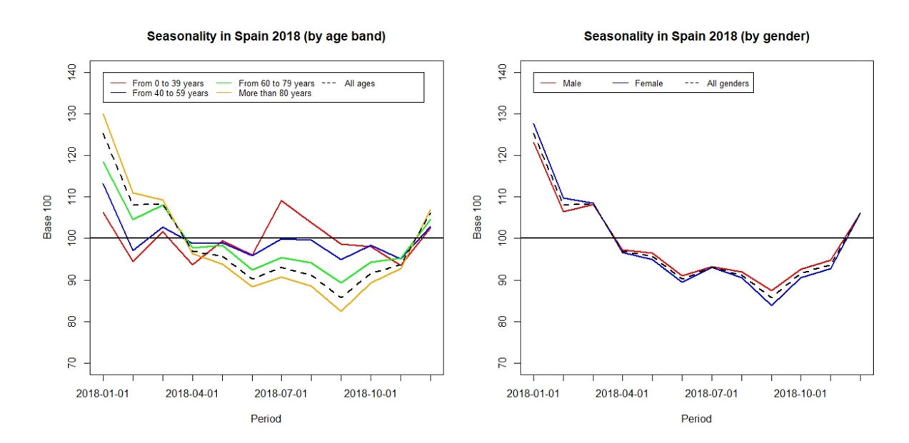
The analysis of the causes of seasonality in mortality cannot be completed without taking into account two of the risk factors most closely watched by life (re)insurers: age and gender. While there are no large variations l by gender, the same cannot be said for age.
For a more effective comparison between ages, we divide the data by age bands, and later we will standardize the monthly mortality rates to the average of each age bracket from a base of 100. Figure 6 shows the comparative data by both gender and age bands for 2018. We observe how the highest ages are those that contribute most significantly to the seasonality of mortality in Spain, especially the age bands from 60 years to 79 years old and over 80 years old, while for younger ages this phenomenon is hardly observed.
By gender, the same methodology has been followed, but in this case, there are no distinctions between male and female mortality rates.
Time series and mortality components
A time series is nothing more than observations of a random variable over time or a set of data ordered in time that may have certain correlations between data points.
In our case, we will have an ordered set of monthly mortality data by cause of death that we have previously derived with data from the National Institute of Statistics. We will use the R statistical software to illustrate how we can analyze the time series of monthly mortality rates.
Once the data has been prepared ande saved in a comma delimited file (Datos.csv), we use the read.csv() function. The following R code will allow us to load our data and create the object datos. The file being loaded contains the monthly mortality rates for all causes of death between the years 2002 to 2018:
> datos <- read.csv("Datos.csv")
In order for R to understand that it is a time series, we will use the ts() function, creating the ts_datos object, where we will also indicate the frequency and the start date of the data.
> ts_datos <- ts(datos, frequency = 12, start = c(2002,1))
In this way, we will have the monthly mortality data loaded as a time series in our statistical software.
Visualization is a first step to analyze and interpret data. We will use the following lines of code to generate a line graph, very similar to that shown at the beginning of the article and in which we will observe its potential patterns, including seasonality. There are several libraries that can be used in R to make graphs, although the function that we will use for this purpose will be the plot() function.
> plot(ts_datos)
Four elements or components are usually distinguished in a time series:
- Trend,
- Cyclical component,
- Seasonal component, and
- Residual variations
The Trend is a long-lasting movement or trend of the observed phenomenon, in our case mortality, and which represents its general evolution. If the only component that appeared in a time series was the Trend, the natural method to estimate it would be least squares regression, by means of which we would fit the line, polynomial, exponential or logistic trend, to the point cloud provided by the time-series.
Cyclical Component refers to movements with amplitude and periods, generally greater than one year and not constant. That is, they are movements that are repeated periodically, but they are not as regular as Seasonal Movements.
Trend and the Cyclical Components are often combined to create Extra-seasonal Components (or Trends), as we will see later when we decompose our time series.
Seasonal Component refers to variations or fluctuations that occur with periodic behavior patterns that are generally known and constant and less than a year.
Finally, the Residual Variations, also known as noise, are small perturbations without any regularity and of relatively low amplitude. They represent the remainder of the time series not captured by the other three components.
The stl() function will allow us to decompose a time series into its three different components, as both Trend and Cyclical Components are combined. A decomposition of the time-series can help us interpret the time-series. The stl() function makes use of local polynomial regression to extract the seasonal and trend components of the time-series. The following R code performs the decomposition of the time series of monthly mortality rates and plots the components.
> descomponer<-stl(ts_datos, s.window="periodic")
> plot(descomponer)
Figure 7:
Time Series Component Decomposition Graphics
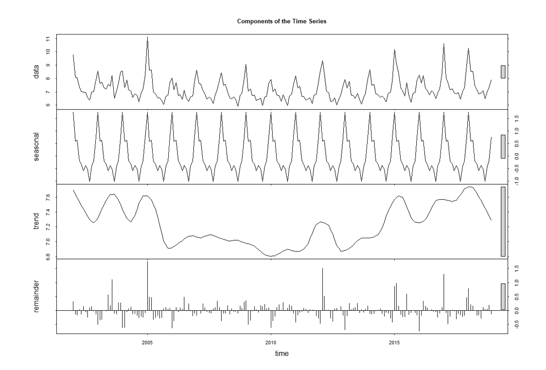
Figure 7 shows the decomposition of the time-series components. The first of the graphs, called data, shows the original data used followed by the Seasonal Component (shown as the seasonal label). In the seasonal graph, two additional peaks are observed in addition to January, which correspond to March and August. These months usually coincide with the most relevant holiday periods in Spain. The following graph refers to the Trend component, under the trend label, where some of the features that we have previously discussed can be observed, such as the increase in deaths in the summer of 2003, the increase in deaths in the winter 2005, and a slight upward trend from 2013 onwards. In the last of the graphs, we find the Residual Variations.
ARIMA models applied to the Time Series of monthly mortality rates in Spain.
There is an extensive literature on the application in time-series of Autoregressive Integrated Moving Average models, also known as ARIMA(p,d,q), which parameters are p, d and q. R has numerous procedures for estimating, validating and predicting with these models.
Time series often have a seasonal component that is repeated across all observations. To cope with seasonality, ARIMA(p,d,q) processes have been generalized, establishing SARIMA(p,d,q)(P,D,Q)[m] models and Seasonal Autoregressive Integrated Moving Average models, where P, D and Q are the parameters of the Seasonal Component and m is the period of seasonality.
The analysis of a time series and the estimation of an ARIMA, or SARIMA, process is usually carried out in several stages.
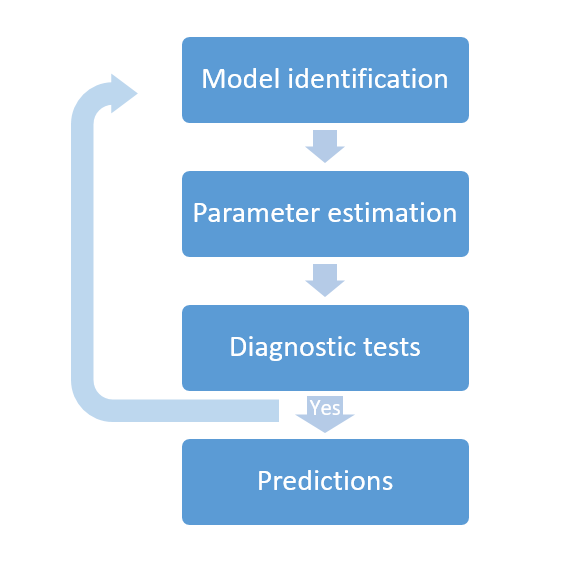
We must first determine the smallest values of p, d and q of the ARIMA process, and P, D and Q in SARIMA case, that are necessary to explain the time series. This first stage is called Model Identification.
Then we must estimate the model parameters and consider whether or not they are significant. The estimation can be performed by using maximum likelihood methods.
Later we will have to check if the model fits the data adequately through a diagnostic test process.
And finally, in the event that the diagnostic tests are satisfactory, then we can make predictions. Otherwise, we will have to start the process again.
To facilitate the task, we are going to use the R forecast library, which includes the auto.arima() function that automatically fits a SARIMA model to a given time series. In this way, and in a few lines of code, we can create our model. The R code to do this is shown below after first loading the forecast package.
> library(forecast)
> ajuste1 <- auto.arima(ts_datos, stepwise = FALSE, approximation = FALSE)
It is usual for a model not to fit a very long time series very well, and it is necessary to make adjustments for periods of time. It can be especially important to obtain a good fit for the final period to make predictions. That is why, when creating the model, we have selected the last periods of the series, from 2015 to 2018.
> seriefinal <- window(ts_datos, start = c(2015, 12), end = c(2018, 12))
> ajuste2 <- auto.arima(seriefinal, stepwise = FALSE, approximation = FALSE)
Diagnostic tests of the estimated model can be carried out using the tsdiag() function. The R code to do the diagnostic tests is shown below, which will generate Figure 8.
> tsdiag(ajuste2)
Figure 8:
Diagnostic tests results charts
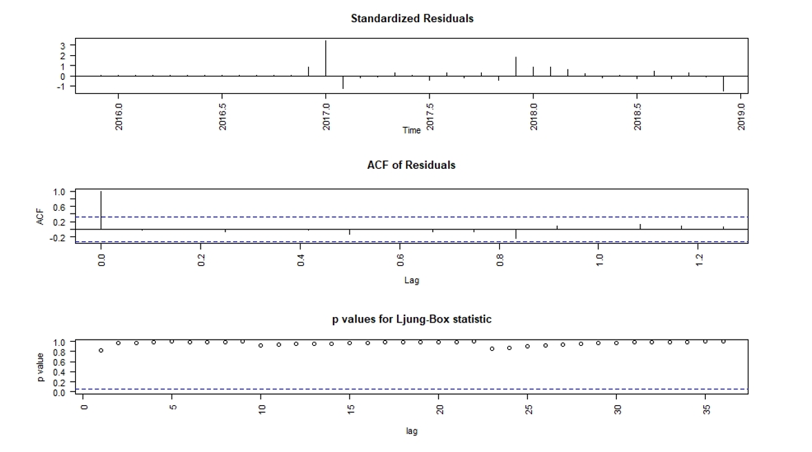
To check the validity of the models, the tsdiag() function plots the model residuals, a correlogram of the residuals, and calculates the Ljung-Box statistics to test the null hypothesis that the residuals are not autocorrelated. Figure 8 shows the standardized model residuals, autocorrelation function of the residuals, and p-values of Ljung-Box statistic at different lags. In our case, the Ljung-Box statistic is highly insignificant at different lags, and the autocorrelation function (ACF) shows insignificant correlation, which leads us to consider the fitted model as adequate. It must be noted that the tsdiag() function overstates the p-values for the Ljung-Box test, but as our model is relatively simple, this overstatement is minor.
Finally, and surely it will be of even greater interest, once the model is built, predictions can be made using the forecast() function from R library with the same name. The R code used is shown below, and we will use plot() function to create Figure 9.
> estimacion <- forecast(ajuste2)
> plot(estimacion)
Figure 9:
Prediction graph
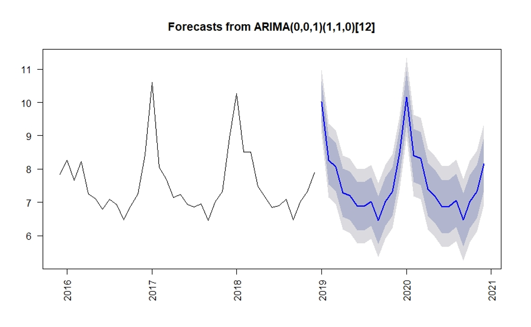
In Figure 9 model parameters are shown ARIMA(0,0,1)(1,1,0)[12], and predictions for the two years after the last available period are shown in blue, as well as the 80% and 95% prediction intervals calculated by default by the forecast() function.
We have to take into account that this type of models does not capture extraordinary events such as a pandemic, so our forecasts for 2020 are expected to deviate from the actual numbers.
Conclusions
Mortality in Spain presents seasonality typical of the northern hemisphere, where there is a higher mortality in the winter months than in the summer months.
This seasonality is largely due to the fact that two of the three main causes of mortality in Spain involve diseases of the circulatory system and the respiratory system, which are more prevalent during this time period
There are other causes with seasonality with opposite signs, such as external causes of mortality, where the mortality rate is highest in the summer months.
Although there are no large differences by gender, variations are observed by age Mortality is observed to be far more pronounced at older age ranges.
The magnitude of seasonality is not constant over time. One way to quantify it is through the winter-summer ratio.
With the use of modern and powerful statistical tools, we will be able to analyze a time series, in our case the monthly mortality rates in Spain, observe and understand its components, and perform modeling with Seasonal Autoregressive Integrated Moving Average models (SARIMA) in order to make predictions, which may be of interest to insurance companies.
Finally, we have to take into account that this type of models does not capture extraordinary events, such as the current Covid-19 pandemic situation, so our forecasts for 2020 are expected to deviate from the actual numbers.