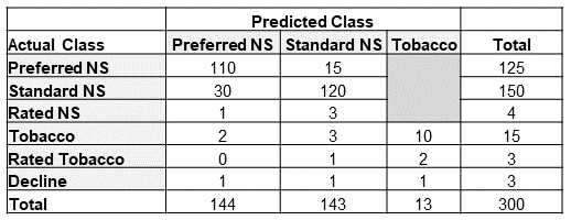
First Principles Approach
So how does the D1 Impact calculation compare to a first principles approach? What I mean by first principles here is comparing the projected benefits using the actual class against the projected benefits using the predicted class. How close is the simplified D1 Impact estimate to the difference between these two cashflows?
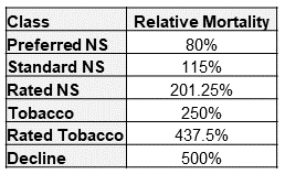
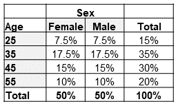
To provide this comparison, I created two projection models. One built at a pricing cell level and another at a seriatim level. For simplicity, I only modeled lapse and death projected annually for 25 durations on a count basis. Table 4 and Table 5 outline the assumptions chosen for lapse and mortality, respectively. No mortality improvement was applied. Lapse rates were chosen to reflect general trends observed between risk classes for longer-duration term products. Table 6 shows the assumed distribution by age and sex. The distribution for actual and predicted risk classes was set to match the distribution in Table 1.
Table 4
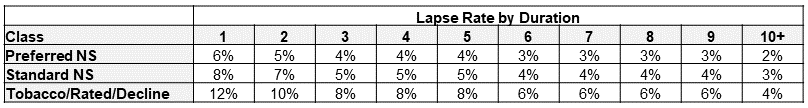
Table 5
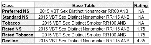
Table 6
Before running the projections, there is one key decision to make related to lapses. Which lapse rates should be used when projecting the actual class benefits? I will present two alternatives here for the reader to consider. Method 1 is to simply use the lapse assumption associated with the actual class. This is mostly straightforward and reduces the number of cells needed for a pricing model. With method 1, there is a question as to which lapse rates are appropriate for declined cases. For this example, method 1 will use the substandard/tobacco lapse rates for declined cases. This follows the spirit of method 1, which keeps mortality and lapse assumptions aligned by actual class. However, one could argue that lower lapses may be warranted for actual declines that would get an offer with the predicted class.
Method 2 considers that lapse behavior could be more influenced by the premium charged rather than the actual mortality risk assessed. For example, someone with a predicted class of preferred NS and an actual class of rated NS may be more likely to exhibit lapse behavior in line with the preferred NS assumption. Method 2 uses the predicted class lapse rates as the assumption for the actual risk class benefit projections. This adds a great number of cells to a pricing model. Rather than just modeling the six actual risk class dimensions for the actual projected benefits, every populated cell in the confusion matrix (14 in this example) is a risk class dimension with a distinct mortality and lapse assumption combination.
Pricing Cell Projections
Fortunately for you, the reader, I have gone and modeled both method 1 and method 2 to look at the differences between the two. Figure 1 shows the ratio of the actual and predicted mortality benefits over 25 durations projected using the pricing cell models. Figure 1 also includes a reference line for the mortality impact estimated using the D1 Impact calculation.
Figure 1
Actual/Predicted Death Benefits by Duration
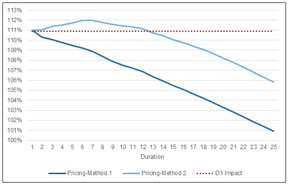
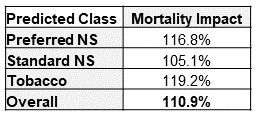
There are a couple interesting results from this figure. First and foremost, at duration 1, both methods align almost exactly with the D1 Impact estimate (111.0% vs 110.9%). This is by design and would be concerning if there was no alignment in duration 1. The pricing model projections could have been different at duration 1 but only if the age and sex distribution had been varied by risk class. The D1 Impact calculation only considers the differences in mortality associated with risk class and does not capture any impact from misclassifications occurring at older/younger ages or occurring more/less often for females/males. I will illustrate with the seriatim projection model the impact that different age and sex distributions can have.
The second interesting result in Figure 1 is the shape of the ratio of actual-to-predicted death benefits after duration 1. Method 1 essentially shows the wear-off of select factors from the 2015 VBT table as the mortality rates approach the ultimate rate. Note that there is still a small differential out in duration 25 as I have not removed the table rating for substandard cases or the rating applied to declined cases.
For method 2, the ratio of actual-to-predicted death benefits increases after duration 1 before starting to grade-off. Why does this happen? Because lapse rates for the cells with the most severe misclassifications have been reduced, more lives persist at elevated mortality rates relative to what is expected under the predicted class projections. This impact is larger than the preferred wear-off for the early durations, so the ratio of actual-to-predicted death benefits increases before starting to wear off.
One less interesting result to point out, is that mortality impact, when calculated using a geometric average, is not aligned with the first principles result. I’ve spared the reader the calculations, but the D1 Impact calculated with a geometric average for this example is 106.6%. This is well short of the first principles duration 1 impact. The magnitude of this shortfall will vary depending on the makeup of the audit misclassifications.
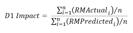
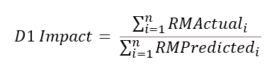
While death benefit projections are great, actuaries have an unrelinquished desire to turn any array of cashflows into a single number. With that in mind, another measure of mortality impact that uses the present value of the projected death benefits can be created as illustrated in the PV Impact formula. For the examples in this article, I’ve used a flat 3% discount rate in all present-value calculations.
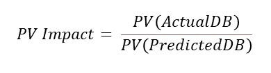
Table 7
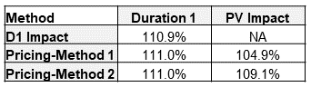
Table 7 summarizes the mortality impacts calculated thus far. In this situation, the PV Impact from method 2 is just slightly less than the D1 Impact estimate. Method 1 PV Impact is less than half of the D1 Impact estimate. Regardless of whether method 1 or method 2 is used to model actual projected death benefits, I would issue a word of caution when using the PV Impact approach to measure mortality impact.
The PV Impact calculation provides a holistic, life-of-the-policy view of mortality impact. Essentially, when all is said and done, what will the total additional mortality have been, discounted back to the present. This number can be helpful, perhaps as a key performance indicator. The PV Impact estimate can also help place a dollar value on the cost of new underwriting programs. However, caution is warranted if using it for assumption setting.
Applying the PV Impact estimate as a flat multiple to the predicted class mortality should cover the additional expected death benefits over the life of the block of business. However, if the timing of the benefits is a concern, the PV Impact estimate will result in understating the impact early on and overstating the impact in later durations. If the PV Impact is used to adjust assumptions, under no circumstances should the PV Impact estimate be graded off, as it already reflects the mortality differences over time.
I do highly recommend that companies use a first principles approach to measuring mortality impact to determine an appropriate shape or grade-off for mortality impact applied to their assumptions.
This may not be calculated as frequently as the D1 Impact due to time and resource constraints but is important to check when considering updates to mortality assumptions related to the audit findings.
Seriatim Projections
Let’s turn our attention now toward what results look like for seriatim projections. For this exercise, I created a seriatim listing of the 300 audit cases summarized in the confusion matrix in Table 1. Age and sex were chosen randomly, using the age and sex distributions in Table 6 as the probability of each cohort. For illustration purposes, I’ve selected three different randomly assigned scenarios that represent a better, similar, and worse mortality result compared to the Pricing-Method 2 projections from Figure 1. I should note that the better and worse scenarios are extreme examples and were chosen to help show the range of possible outcomes with the seriatim projections. Method 2 was used for assigning lapse rates. Figure 2 shows the ratio of actual-to-predicted death benefits by duration for these three scenarios. The Pricing-Method 2 projection is also included for reference. Table 8 shows the duration 1 and present-value mortality impact estimates for the seriatim projections.
Figure 2
Actual/Predicted Death Benefits by Duration
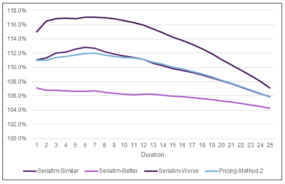
Table 8
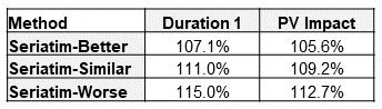
There is certainly some aspect of random volatility associated with small samples going on in Figure 2. However, the drivers of the volatility highlight blind spots of the D1 Impact estimate alluded to previously—age and sex. The D1 Impact relies on relative mortalities that are set at the class level. Within any given class, base mortality rates for older ages and males are higher. The single number chosen for a given class’s relative mortality is based on an average age and average split by sex. If the actual makeup of age and sex varies from the average, then there will be different results, as seen with the seriatim projections.
Take the seriatim-worse projection as an example. In this audit sample, the cases with the most significant mortality impact are the decline and rated tobacco case with a predicted class of standard NS and the decline case with a predicted class of preferred NS. For the seriatim-worse scenario, these two declines were assigned age 45/male and age 55/female. The rated tobacco case was assigned age 55/male. The severe nature of these misclassifications is made even larger when occurring for ages above the average age for the sample population.
The opposite occurs in the seriatim-better scenario projections. The same two declines in this scenario were both assigned to age 35/female and the rated tobacco case to age 25/male. With younger ages and more females than average in the most severe misclassifications, the seriatim projections end up with lower projected actual benefits compared to the pricing cell projections.
With this understanding, one of the shortcomings of the D1 Impact estimate is laid bare. While the makeup of the audit sample should be representative of the population it was drawn from (assuming it is a random sample), the makeup of the misclassifications may not be. This is an interesting and valuable bit of wisdom. If the misclassifications in your audit sample are consistently occurring at ages older or younger than your sample population, then the D1 Impact estimate may need to be adjusted. One possible fix to this shortcoming would be to assign relative mortalities at an individual level (considering class, age, and sex). However, the additional work needed to do so negates the straightforward nature of the D1 Impact calculation.
A similar shortcoming is possible when considering results by face amount. Obviously, larger face amounts will project larger death benefits. Thus, if misclassifications are occurring for larger than average face amounts, then the D1 Impact estimate using counts would be insufficient. This can be easily rectified by populating the confusion matrix with the total face amount in each cell rather than the count. In doing so, the mortality impact calculation becomes a ratio of weighted average relative mortalities, with face amount serving as the weights. The mortality impact estimate by face amount will be larger than the estimate by count if misclassifications are occurring at larger than average face amounts.
Conclusion
In conclusion, mortality impact estimated using the D1 Impact calculation provides a reliable estimate for the duration 1 mortality impact. First principles projections can provide insights into how the duration 1 impact grades-off over time and will vary depending on the assumptions and methodology chosen to project benefits. Mortality impact calculated using the present value of projected benefits will understate the impact in early durations and overstate it in later durations if used in assumption setting. Lastly, the age/sex/face amount distributions for misclassifications should be monitored within audit samples. If the distribution for any of these attributes for misclassifications consistently varies from the sample population, then the D1 Impact estimate may need to be adjusted. A comparison of seriatim level projections for actual and predicted benefits can help inform the mortality impact in this case.