What prompted RGA to embark on a brand refresh now?
It has been 15 years since our last update, and in today’s dynamic landscape, change is essential. Over time, RGA, our clients, our partners, and our competitive landscape have evolved significantly. RGA’s 50th anniversary in 2023 provided added motivation to reflect on how far we’ve come and all that we plan to achieve in the years ahead.
The RGA brand reflects our strength, values, and culture – all critical to building long-lasting relationships and delivering sustainable long-term value. As we continue to provide top-tier solutions and capabilities to our clients, while delivering on our purpose to make financial protection accessible to all, our brand must align with our aspirations.
What inspired the key elements of the refreshed brand?
We drew inspiration from the trust our clients have in RGA, the pride our employees bring to work every day, and the spirit of innovation that drives our success. To capture this visually and clearly, the three core brand components are:
Confidence in Red: The color red has embodied RGA’s strength, confidence, and bold innovation for years. We continue to embrace this color to visually communicate our drive to help shape the future and create new paths to growth.
New accent colors, purple and blue, symbolize our creativity and collaborative culture and strength and stability, respectively.

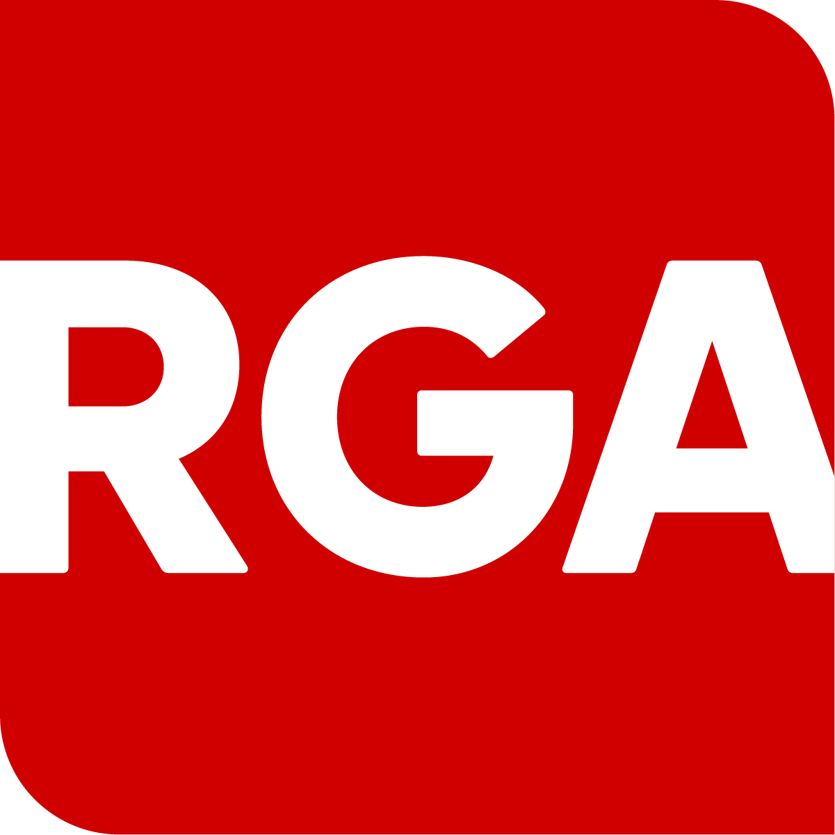
Logo: The refreshed logo is bold and differentiating, highlighting our confidence in red. Furthermore:
The open edges represent our innovative and outside-the-box thinking
The rounded corners with a solid structure indicate RGA’s approachability, agility, and humanity anchored by strength and stability
The container shape symbolizes the financial protection we offer our clients, and our inclusive purpose of making that protection accessible to all
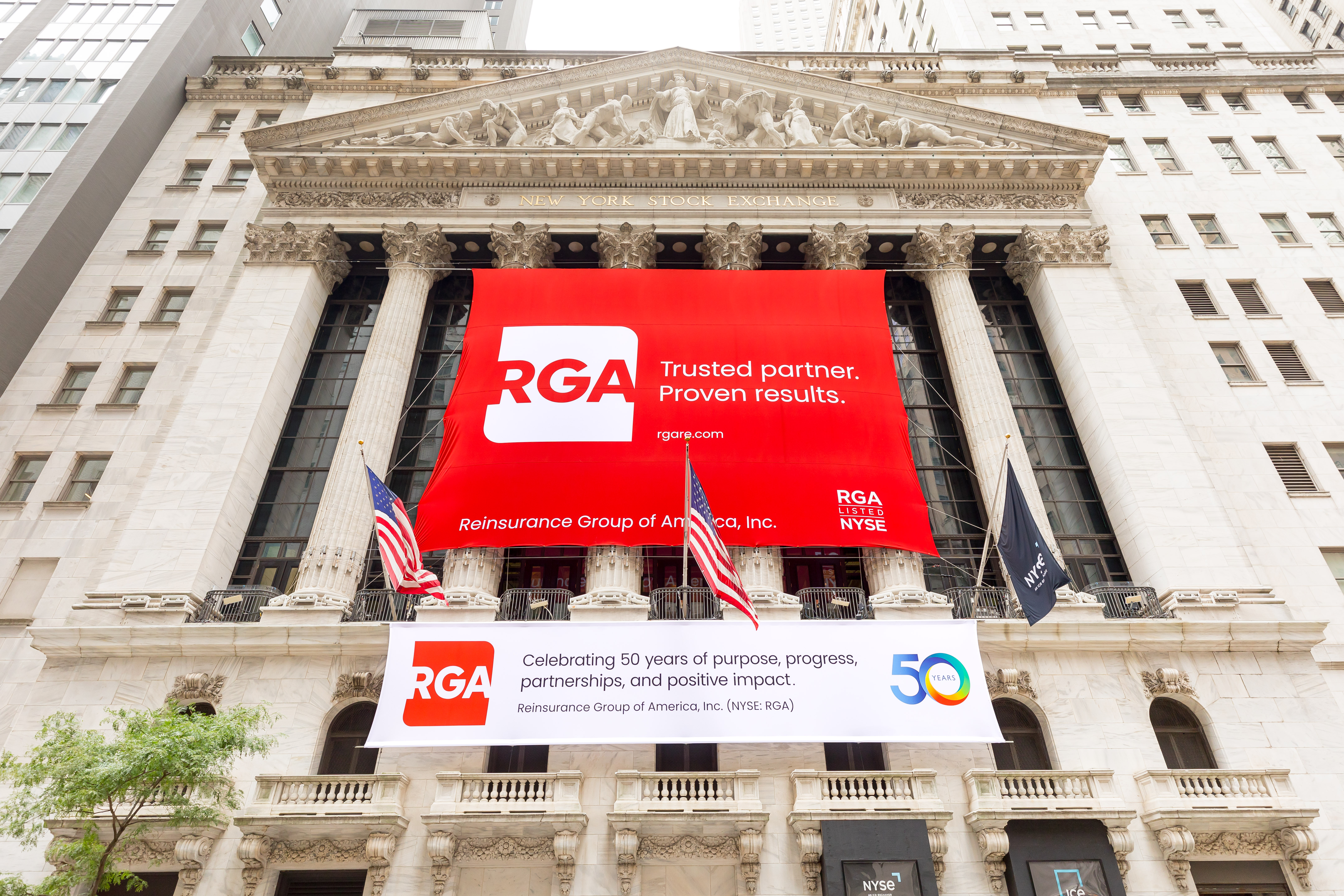
Tagline: The new tagline – “Trusted partner. Proven results.” – reflects who we are and what our clients have told us. It articulates RGA’s identity as a highly trusted organization deeply rooted in partnerships to drive progress and performance.
 Photo courtesy of the New York Stock Exchange

